Amazing small museums: Munson
Immediately upon entering Munson in Utica, NY, we were greeted by a friendly security guard and escorted to the pride and joy of the Munson: the original version of Thomas Cole’s four-panel Voyage of Life. She told us that the well-known version in the National Gallery in Washington, D.C. is a later version, painted when the patron for the original work passed away and the artist’s payment was tied up in probate. Cole needed money and couldn’t wait for the court settlement, so he painted a slightly different version over the next two years, and that’s the one hanging in the National Gallery. The second version is not an exact replica; there were compositional and pictorial adjustments, e.g. the figure in Manhood is standing in the first version, but kneeling in the second version. The overall palette and tone is slightly different as well, with the second being more vivid.

Thomas Cole, Voyage of Life (Childhood, Boyhood, Manhood, Old Age). 1839-1840
After admiring the Cole series, we wandered around the museum on our own and were amazed by the depth and quality of the collection, particularly the holdings of 20th century art.
I was mesmerized by Gino Severini’s Spherical Expansion of Light (Centripetal and Centrifugal)
Here Severini uses a pointillist technique, with small, repeated, dotted or tessellated marks building color optically. These micro-marks create a sense of vibrating light that you can almost feel looking at the painting. The title accurately describes the visual pull of light: arcs, concentric fragments and rotating triangles push the eye toward the center of the painting, then propel it outward. Hues aid in moving the eye around the canvas, with warm yellows and pinks at focal points (suggesting luminous, glowing cores) giving way to cool blues and violets at the outer edges.

Gino Severini’s Spherical Expansion of Light (Centripetal and Centrifugal), about 1914
Later in life Severini became celebrated for his mosaics and worked mostly on decorative projects; on this canvas you can already see a mosaic-like approach with the small, tessellated strokes and bright color, making the later mosaics feel like a natural transition.

Detail, Gino Severini, showing the tessellated brushstrokes.
Like Severini, Piet Mondrian was exploring a new painting language and approach in his tree series. In the Munson’s Tree (Horizontal Tree) the heart of the composition is a painterly, interlocking network of red lines, representing Mondrian’s early attempts to refine his visual field into horizontal and vertical lines that symbolized harmonious balance. All trees have branches that split, echo, and repeat, and Mondrian was fascinated with these hidden structures and rhythms, as he worked his way toward abstraction. As the broad, horizontal tree branches outward and upward, the focus is on directional movement – the feeling of energy – as it is in Severini’s rotational depiction of energy.
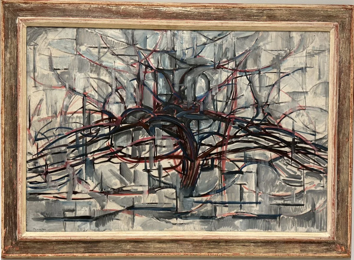
Piet Mondrian, Tree (Horizontal Tree), 1912
Special Offer for Blog Readers
If you’re reading this blog, chances are you love art almost as much as I do. I would be grateful if you took a few minutes to check out my art. I create joyful, layered contemporary landscape paintings in encaustic and mixed media. As a special thank you for reading my art blog, I would like to offer you 20% off any of my paintings. Just use the code BLOG20 at checkout. Please also note that my prices include free shipping within the continental US.
The museum also has a pair of striking Mark Rothko canvases. These two paintings traveled outside of the US for the first time in 2023, for inclusion in a major retrospective exhibition of Rothko’s work at the Fondation Louis Vuitton in Paris.
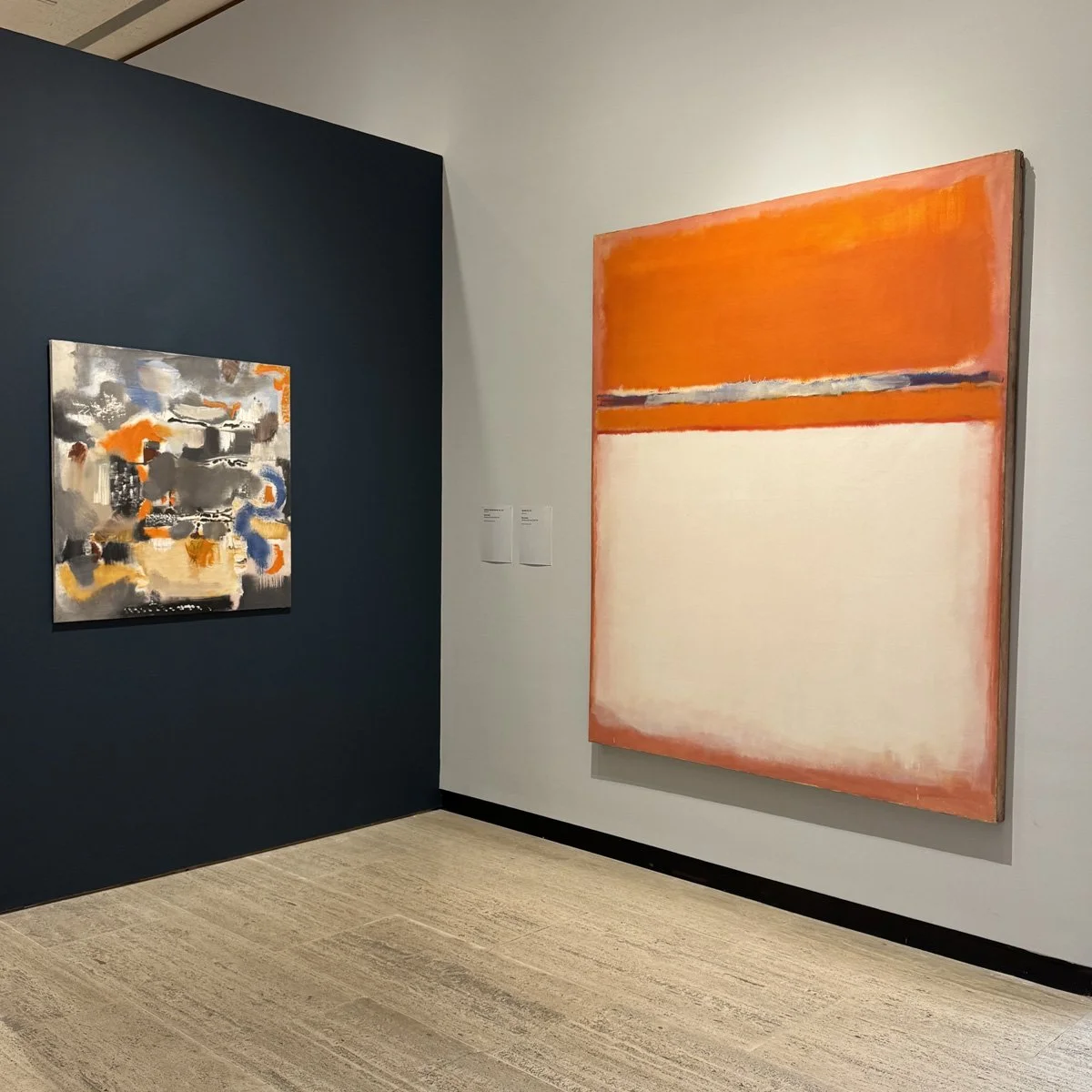
Mark Rothko, Untitled: Abstraction No. 11, 1947 (Left) and Number 18, 1951 (right)
The painting on the left, Untitled: Abstraction No. 11, 1947, is the earlier work, predating his signature color field paintings. It is a bit of a tumultuous jumble of colors - orange, blue, black and silver. Rothko and his wife divorced a year before he created this painting, and his emotional turmoil seems evident in the piece. Rothko painted his first color field painting in 1949, and by the time he had painted the canvas on the right, Number 18, in 1951, he had mastered a more simplified visual language. Rothko viewed his fields of color as spiritual planes that could tap into human emotions, and the expansive color fields were meant to “eliminate of all obstacles between the painter and the idea, and between the idea and the observer.” But while Rothko was intent on tapping into the viewer’s emotions, his color palette in these paintings also clearly reflected his own emotional state. The striking vermilion here is joyful and energetic; in his later color field paintings his palette turned quite dark and consisted of somber blues, blacks, and grays, as he struggled with depression. Rothko committed suicide in 1970 at 66 years old.
The fiery intensity of the red-orange color field in Number 18 is separated from the calming, warm, off-white field by a thin band of what looks, from a distance, to be metallic paint. But on closer inspection the band is a muted grayish-blue, with irregular touches of violet and olive green. While the band functions like a horizon, or threshold, between two very different emotional states, the line isn’t hard-edged -- it feathers and bleeds, suggesting permeability between these contrasting emotional states rather than a sharp dividing line.

Detail, Rothko’s color field painting Number 18
On a more representational note, I had two favorite paintings: an Edward Hopper landscape and a Milton Avery figure painting. Hopper painted The Camel's Hump during his second summer (1931) renting a cottage at South Truro, at the outer reaches of Cape Cod. The wall label made this Mainer laugh: Hopper stated he “chose to live here because it has a longer summer season. I like Maine very much, but it gets so cold in the fall. There's something soft about Cape Cod that doesn't appeal to me too much. But there's a beautiful light there-very luminous—perhaps because it's so far out to sea; an island almost." Hopper described the terrain as “a desert on a small scale.” This dunescape is indeed luminous, although the varied, lush greens in this dunescape don’t feel desert-like at all.
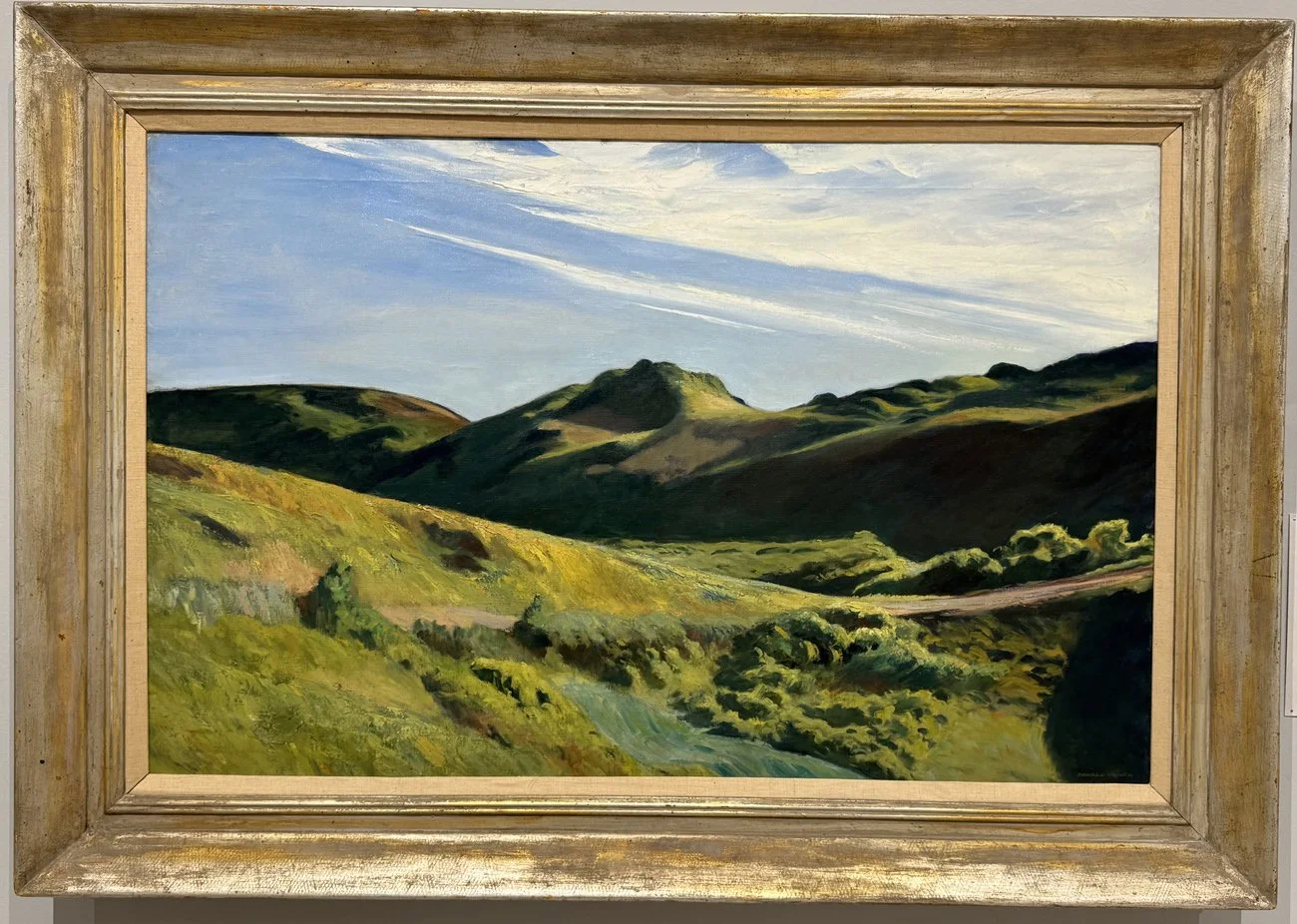
Edward Hopper, The Camel’s Hump, 1931
The Munson owns at least two Milton Avery paintings; the still life Pink Tablecloth and a figurative painting titled Poetry Reading. Poetry Reading’s deliberately restrained, harmonious palette of warm ochres, browns and siennas conveys exactly the sense of serenity you would expect from watching one woman read poetry to another. It’s a snapshot of an intimate, quiet, domestic moment, and you can feel the tenderness between these two women, even though you know nothing about them. Avery was a supreme colorist, even when he was working within a limited palette, and Poetry Reading is a masterpiece among his later figurative paintings.

Milton Avery, The Poetry Reading, 1957
Special Offer for Blog Readers
If you’re reading this blog, chances are you love art almost as much as I do. I would be grateful if you took a few minutes to check out my art. I create joyful, layered contemporary landscape paintings in encaustic and mixed media. As a special thank you for reading my art blog, I would like to offer you 20% off any of my paintings. Just use the code BLOG20 at checkout. Please also note that my prices include free shipping within the continental US. Outside of the US, shipping is invoiced separately, at cost.
This is the second in a series of blogs about a recent art tour we took across New England and New York. The first blog, on the North Lights exhibition of Scandinavian and Canadian landscape painters at the Buffalo AKG Art Museum, can be found here: https://www.marciacrumleyart.com/blog/must-see-art-in-buffalo-ny
Thanks so much for reading my art blog!!